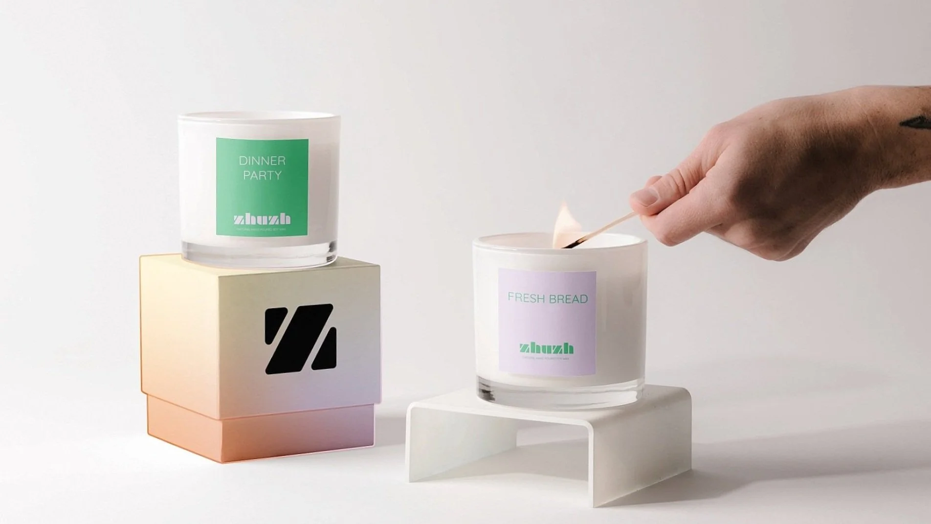
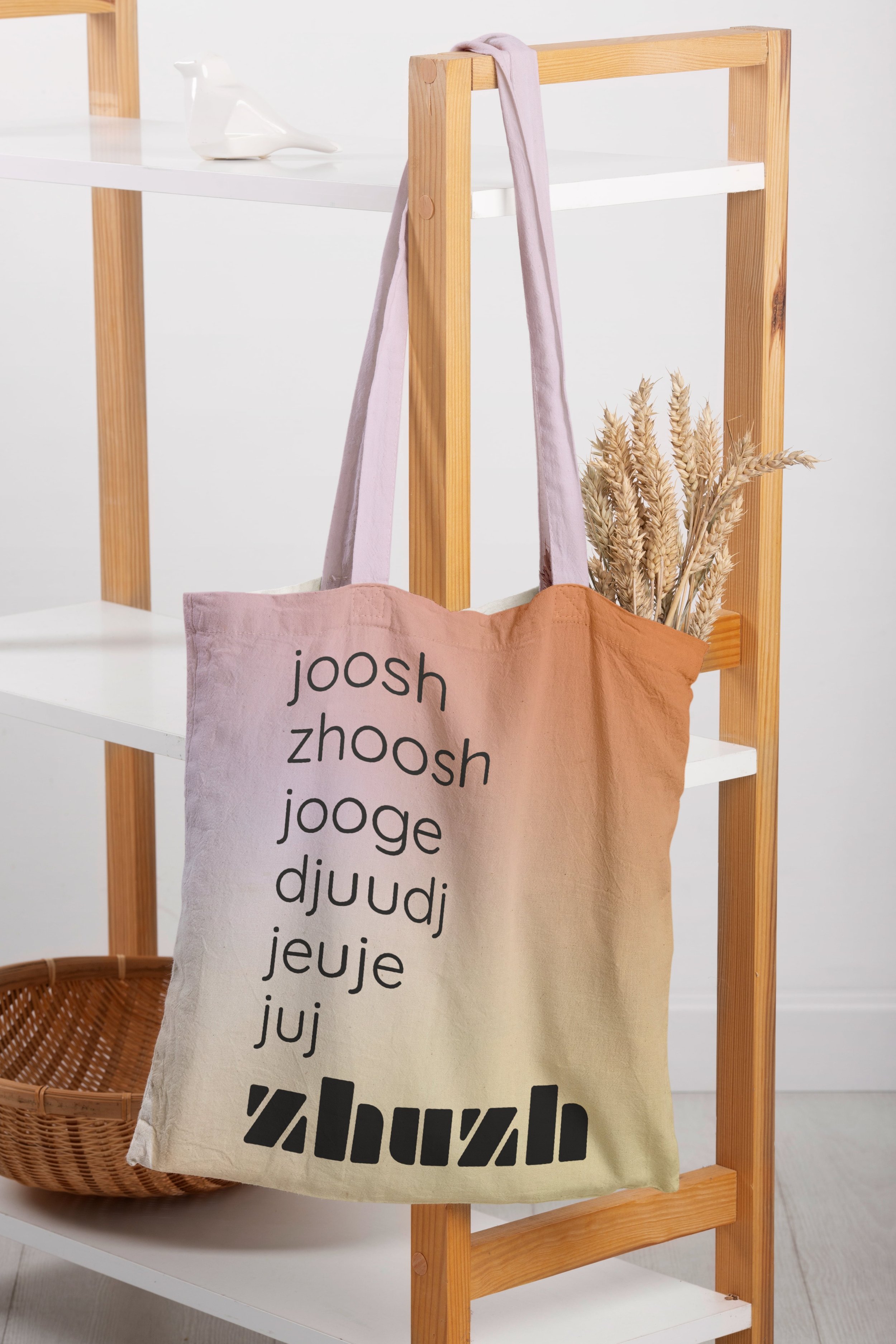
ZHUZH
〰️
ZHUZH 〰️
ZHUZH
Zhuzh is a modern home goods and interiors brand that celebrates connection. It’s literal definition meaning “to make something more stylish, lively, or attractive”, this rebrand gives a fresh look and feel that’s both inclusive and playful. With its vast product offerings, a fun visual language, and friendly tone of voice, Zhuzh highlights the idea of a home as a special place that brings loved ones together to create meaningful moments.
BRAND STRATEGY
ART DIRECTION
VISUAL IDENTITY

Color Palette
This palette merges bright shades with soft tones to create a balanced, inviting aesthetic. Combining these into a vibrant gradient illustrates how blending individual colors can yield a result that is both energizing and comforting, representing the ethos of the brand that fosters togetherness and connection.
Logo
Adapted from the modern, san-serif, Braggadocio, this punchy logo is crafted in lowercase with rounded edges to project a more approachable, light-hearted visual design while also leaving a lasting impression.
Typography
Quicksand, the secondary font used in this design system is clean and minimalist, providing great contrast to the powerful, attention-grabbing logo.